If you follow my blog or my Instagram account you’ll have seen that I recently visited Svalbard. I’m currently working on a collection of (non-Arctic) lighthouse paintings, but I have high hopes to spend the winter holed up in my attic working on a collection of large paintings of the stunning Svalbard landscape.
But a few weeks ago I was able to take part in an art workshop organised by the Pastel Society of Ireland and led by the wonderful visiting US artist Charles Peer (go look at his work – is wonderful and he’s also such a lovely, fun, funny man).
The workshop was fantastic on so many levels. After years where society has been either locked down or tentatively holding back and self-regulating contact, it was brilliant to connect and physically be in the same space as other artists.
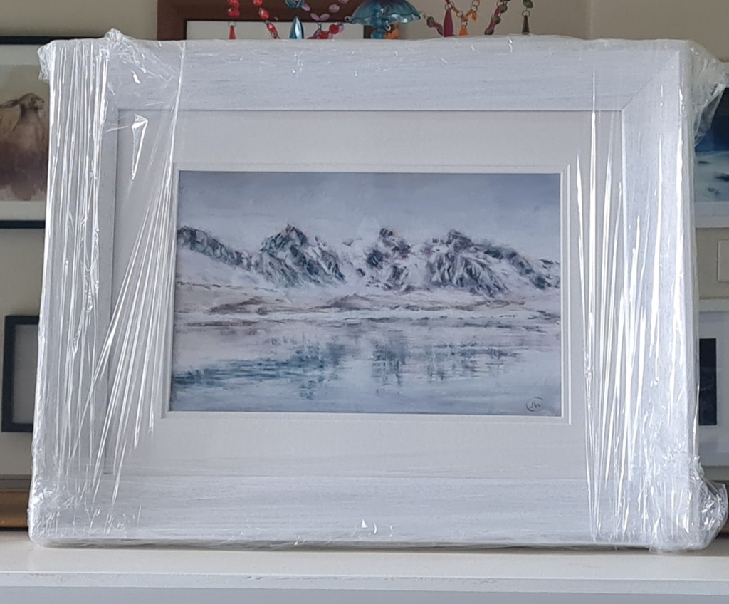
I was nervous; and I did not find this an easy workshop. It forced me out of my comfort zone and made me work in new ways. For most of the day my painting looked appalling – but I’m so pleased with the final result which I’ve just got back from the framer.
key lessons:
- Planning. We were encouraged to play and plan with composition; to write down what attracted us to the image we wanted to paint; what was the *star* of the painting – and then to use that as the touchstone for all our decisions.
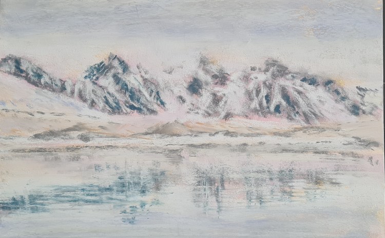
2. Editing. I struggle to paint loosely. Always have done and probably always will. I blend where i know i should layer. The workshop and the medium we were given forced me to work in a different way and I loved the result. We used Lux Archival paper which is more sanded than my usual ‘go-to’ pastelmat and, combined with the small scale of my painting and the very limited palette i used these forced me to pare back in a sparse and spartan style which I think really suits the landscape of the Arctic.
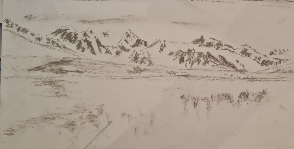
3. Underpainting. Now this was scary for me. Especially since I had in my head the pure blues and grays and whites that I had seen on my trip. I opted for apricots, pinks and pale lilacs and I’m really pleased with the outcome. I’ve since opted to use contrasting underpaintings in other paintings, although I think it’s a technique I’ll dip into when I choose to, rather than something I’ll apply consistently. See below – what Charles called ‘the ugly stage’ of painting…. at this stage I did despair of pulling it back to where I wanted it to be…

4. Alcohol. We also played around with alcohol washes which you can see in the underpainting above. I think i definitely need more practice with that technique!
5. Impact. I guess this relates to composition and detail. But boils down to the fact that most paintings are first seen from across a (crowded) room…. in order to be able to draw the viewer closer the painting needs to have visual impact from a distance. I hope that’s what I managed with my little study of the Lilliehammer fjord in Svalbard.
I DO still want to paint this on a grand epic scale, but I’m also really happy with its sparseness and how it all manages to haunt, and to draw me in, on this small scale.
Here’s the final painting, framed (still in its wrapping).